

Maximising the Value of Oil Analysis in Business Maintenance
In my many on-site business visits, I’ve observed that approximately 90 to 95% of businesses utilise oil analysis. This process involves taking samples, shipping them to a lab, and patiently waiting for the results.
However, a recurring issue that I’ve noticed is how these businesses handle the results. Often, employees scan the report, looking for alarming red or yellow boxes. If they spot a red box, they usually change the oil. Afterwards, the report typically gets filed away, largely forgotten.
This behaviour is unfortunate because the actual value of oil analysis lies not in the immediate results but in their interpretation. The good news is that this interpretation doesn’t require additional spending! The cost of oil analysis testing is essentially in the bottle itself, with the analysis included in the price.
If we consider data the “new oil,” then it’s our responsibility to refine and distil this raw material into something practical and beneficial.
When discussing oil analysis, it’s essential to associate it with different types of maintenance: reactive, preventative, predictive, and proactive. For example, if we liken oil to the lifeblood of an asset, consider how we take proactive measures to care for our blood. This could involve maintaining a healthy diet, exercising regularly, and getting cholesterol readings.
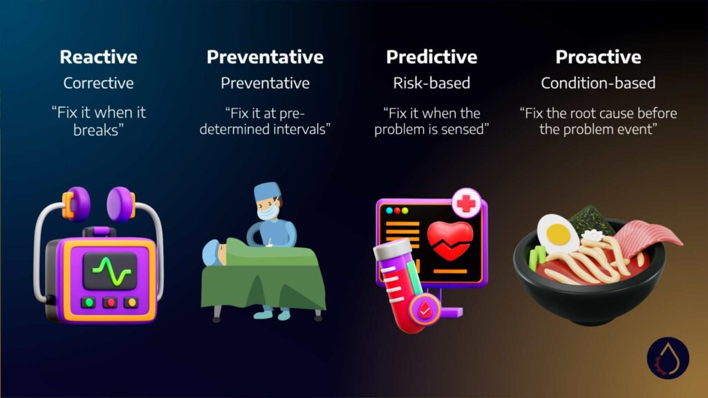
These activities represent predictive maintenance. Analogously, you might weigh yourself monthly, take blood glucose readings, and use this data to make informed lifestyle decisions.
On the other hand, preventive maintenance would be akin to undergoing open-heart surgery at regular intervals. While this may sound extreme, it highlights the risks associated with over-maintenance. Each time you “open” yourself up, there’s a risk of catastrophic failure.
Reactive maintenance, then, is to wait until the asset fails. But our mindset should align with predictive and proactive approaches when it comes to oil analysis.
Oil analysis reports typically include three categories of results: fluid condition, contamination, and wear information. Moving these categories onto the predictive and proactive domain, wear information plays a predictive role as it signals impending failure.
On the other hand, contamination and fluid condition assume a more proactive role. For instance, one of the critical causes of machine failure is contamination. Therefore, we can take proactive measures by measuring this in advance, such as filtering out the contaminants. Similarly, maintaining the fluid condition is another bold action that can help prevent machine failure.
In the end, understanding and effectively interpreting the oil analysis results can lead to better maintenance decisions, ultimately improving the health and longevity of your business assets.
Deciphering Oil Analysis Reports: Step One
The first step in understanding oil analysis is reading the report. All reports generally have a similar structure, although the formatting may vary slightly. They begin with a section detailing the sample information. As you continue through the report, you will encounter data about the oil parameters, such as tam oxidation and nitration. This section might also include details about the type of oil used.
Most of this information falls under the category of fluid condition. A few parameters, like water and soot, represent contaminants, but the majority provide insights into the state of the fluid. The report reveals data about the metals present, typically indicating wear. The following section highlights contaminants, providing insight into the fluid’s contamination levels.
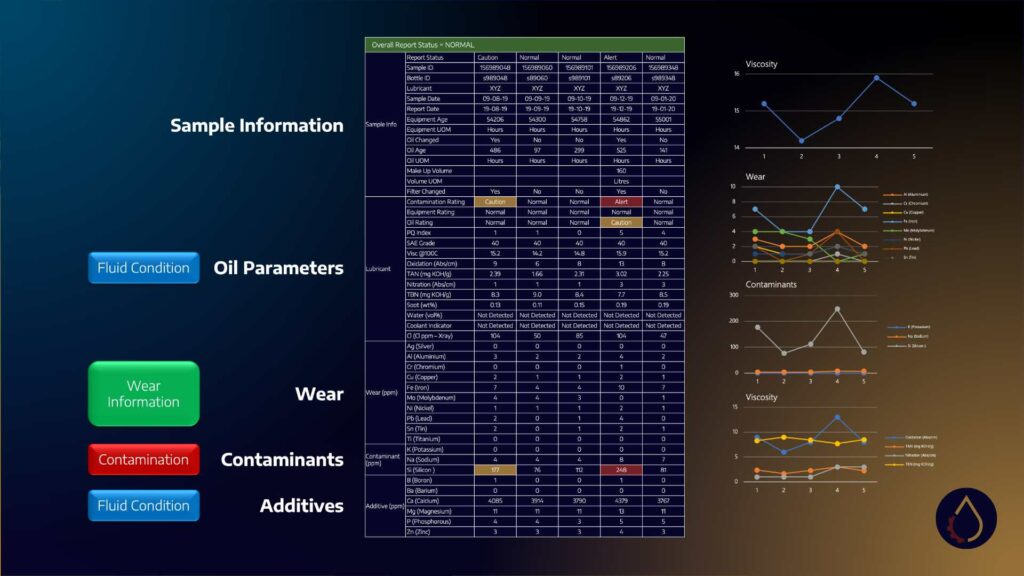
Finally, the report covers additives related to fluid conditions as additives deplete over time. Remember that these categories are approximations; the lab makes educated guesses based on the data. For example, calcium is often considered an additive because it’s a detergent. However, in locations rich in limestone, the dust – primarily composed of calcium – can contaminate your equipment, turning calcium into a potential contaminant. Thus, interpreting these reports requires an understanding of your specific application context.
Let’s move to what I refer to as level one: the traffic light analysis. In this stage, the focus is on any red or yellow boxes in the report, indicating you’re nearing or have exceeded a specific limit. Again, it’s crucial to know that these limits are usually preset and can be based on various factors.
Sometimes, the oil laboratory may set these limits according to Original Equipment Manufacturer (OEM) guidelines. For instance, if you specify that you’re using a Jenbacher gas engine, there will be limits detailed in the manual. If the lab can access this information, they can inform you when you’ve exceeded these OEM limits.
However, I encourage you to verify these limits independently. Occasionally, they might be standardised based on specific rules of thumb, like an alarm for iron levels above 50 parts per million. Other times, they may be statistical, derived from a bell curve of results, with limits set at two or three standard deviations from the mean. Finally, these limits can also be algorithmic, aiming to detect the presence of a specific element, such as coolant.
Often, these limits come with actionable comments, commonly suggesting oil changes. However, these comments are auto-generated and seldom manually reviewed due to the high volume of samples processed daily by labs. While this traffic light analysis is helpful for a quick overview and triage of assets, a more thorough examination is beneficial.
One of the critical parameters to check in an oil analysis report is viscosity. I’ve repeatedly emphasised that viscosity is the most important physical parameter of a lubricant. Your first step is to check if the viscosity is in grade and whether it has varied significantly. If it still needs to, the fluid is likely doing its job well. Once viscosity has been assessed, you can delve into the rest of the report with a clearer understanding of your lubricant’s condition.
Level Two Analysis: Interpretation and Contextualization
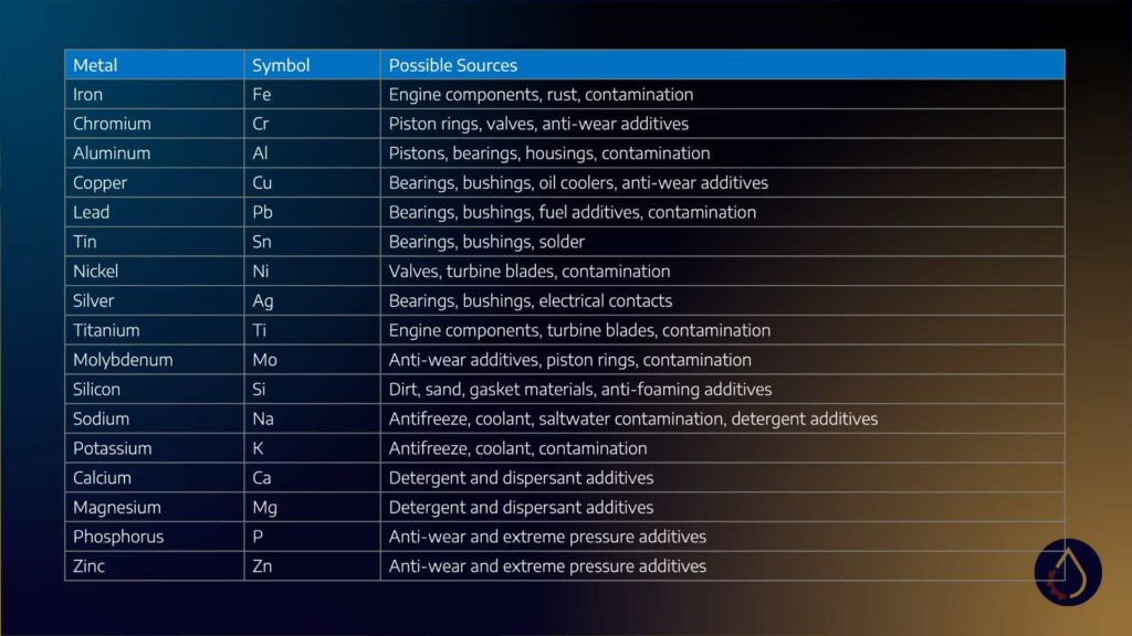
Moving on to level two, we add an extra layer of interpretation. The instinctive place most people turn to is the Inductively Coupled Plasma (ICP) metals, with different elements at the bottom of the page. These are usually broken up into wear, contaminants, and additives. To decipher this, we need to combine our understanding of the application with an assessment of where these metals could have originated.
For instance, if we see elevated levels of copper, lead, tin, aluminium, or iron, we can determine where they might have come from in the machine, thus aiding troubleshooting efforts. A commonly referred table outlines the possible sources for all the different metals. However, these aren’t hard and fast rules; you often need to assess them together.
Consider this: most dirt is composed of both silicon and aluminium. Therefore, if your system is contaminated, you’d expect these elements to trend together. However, the proportion of aluminium and silicon varies in dirt worldwide. Consequently, your task is to observe the trend, ensuring they increase together.
Let’s consider an example where the traffic light analysis might mislead. A test of Caltex de Gold Ultra (an engine oil) at a local laboratory showed an alert for copper because it was at 80 parts per million. The recommendation was to check the crankcase bearings for damage – an invasive and costly procedure.
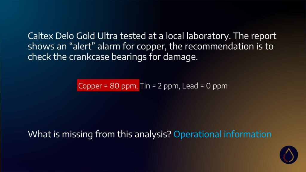
However, the lab needed to be aware that the oil coolers had recently changed. This change triggers passivation, where anti-wear additives like ZDDP chemically swap out for the copper until an inert layer is formed inside the exchanger. While this process isn’t particularly harmful to the engine, it does indicate that the copper isn’t coming from the crankcase bearings.
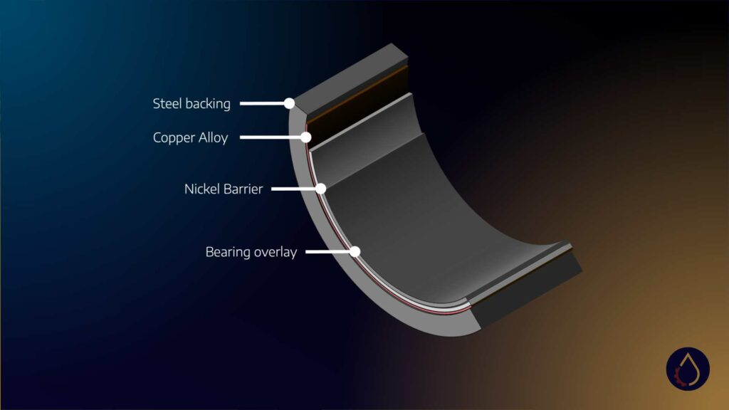
Another reason the laboratory identified the crankcase bearings as a potential source was the presence of slightly elevated tin. When labs detect elevated tin alongside high copper, they often point to crankcase bearings as a potential source. This is based on the composition of most shell bearings, which usually have a steel backing, a soft copper alloy material, a nickel barrier, and a tin or similar material flashing.
However, other sources, like brazing flux or soldering materials, can also contribute to elevated tin levels. Sometimes, there may be no tin or copper in the bearing. So again, knowing your engine’s materials can aid your evaluation. Therefore, when interpreting oil analysis results, it’s essential to combine different pieces of information: the test methods, the formulation, and records from operations or maintenance. This layered and contextual approach will give you a more accurate understanding of what’s happening within your machinery.
Level Three: Harnessing the Power of Trend Analysis
In level three, we delve into trend analysis. This is where the power of oil analysis results truly shines through, providing valuable insights. Every business should aim to reach this stage in its data interpretation journey.
Let’s return to our previous example. Consider copper trending upwards in one of two ways: it could rise exponentially over time or plateau. One pattern is characteristic of corrosion, while the other signifies preservation.
Corrosion often affects engine bearings as the acidity of the oil increases. Corrosion is self-perpetuating; it causes the bearing metal to corrode, releasing metal ions that act as oxidation catalysts, leading to more acid and, consequently, more corrosion.
On the other hand, the passivation of a fresh copper oil cooler slows down over time as an inert layer gradually forms inside the cooler, causing the rate to decrease. One of these situations is more detrimental to the engine than the other. Trending the results over time would reveal such patterns.
Trend analysis is usually incorporated in your oil analysis report and often presented in a chart on the side. However, these charts can be misleading due to their regular intervals. For instance, a nine-day break might be followed by another nine-day interval, then a three-day interval, and finally, a ten-day interval. Plotting these at regular intervals needs to be more accurate.
Instead, applying some thought and understanding of the application to plot results against engine hours, for example, would provide a more realistic representation.
Another common mistake in trend analysis is linear plotting over time, making it challenging to identify trends. For instance, in engine drains, oxidation may increase and then drop when fresh oil is added to the system.
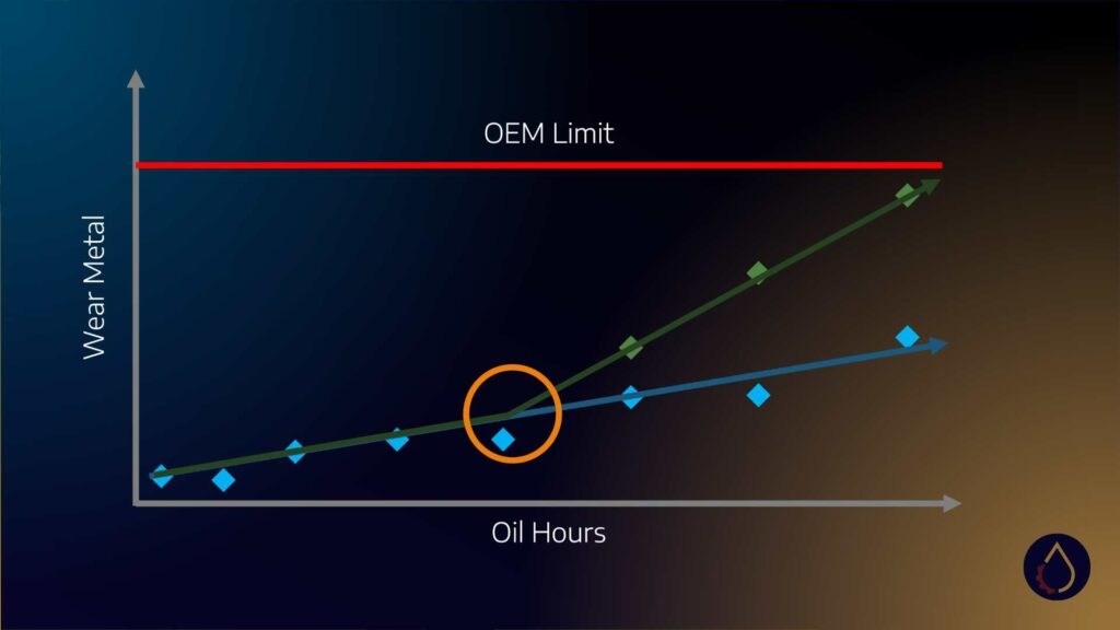
However, the advantage of oil drains is that they produce repeatable data sets. Ideally, these data sets should be plotted over each other. For example, suppose wear metals increase steadily over time, and a deviation in this pattern is observed in the next drain. In that case, we can identify the point at which a problem occurred, leading to a potential failure. This corresponds to initiating the P-F interval’s possible failure (P).
But it’s only by overlaying these results that we can genuinely analyse trends. Therefore, I always encourage my clients to maximise their data. Your oil analysis laboratory will store your data in a database, typically accessible via a web portal or by requesting a download of your results in Excel.
Take that data and explore it. Look for trends and insights. By combining information about the test methods, formulation, and operational considerations, you can unlock the actual value of your data analysis.